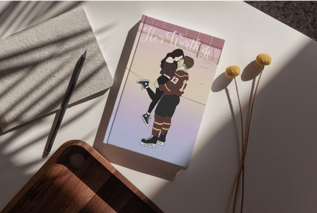

Project About
I started writing the first book of my Christian hockey romance novel in May 2025 after spending two years planning and developing the story. While writing the last few months, I couldn’t help but imagine what the cover might look like. Using my artistic background and what I’ve learned in graphic and web design, I began to bring that vision to life.
Designing the cover was both easy and challenging. I know the story better than anyone, so I wanted the design to truly reflect it, something that would stand out in stores, catch someone’s eye from across the aisle, and make them think, “Oh, what’s that?” I wanted it to be the kind of book that fits perfectly on someone’s shelf, part of their hockey romance collection and aesthetic.
BOOK GENRE: Young Adult, Christian Hockey Romance
TROPE:
- Small Town
- Opposites Attract,
- Love Triangle,
- Just Friends,
- Second Chance.
OPTION 1
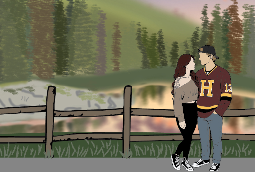
OPTION 2
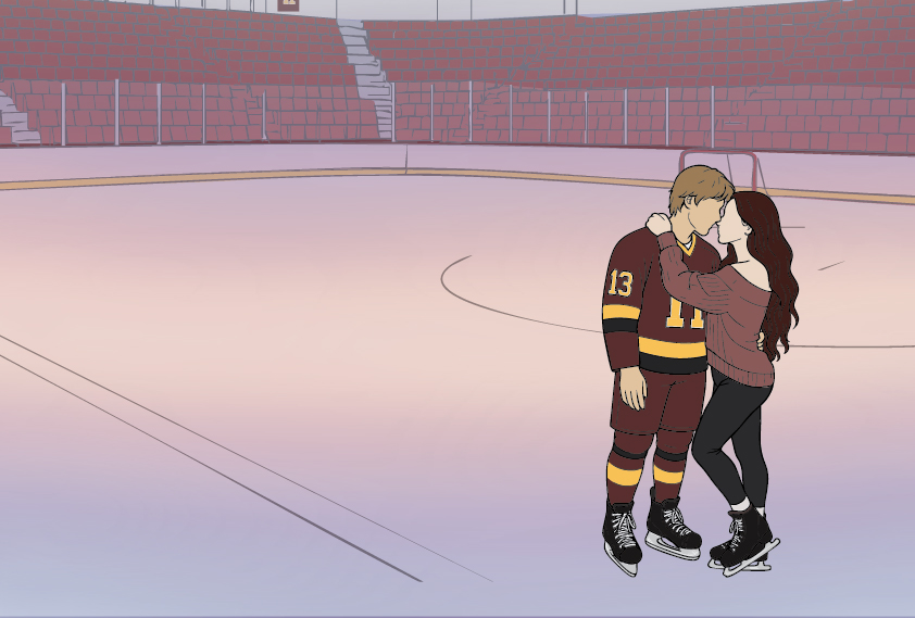
OPTION 3
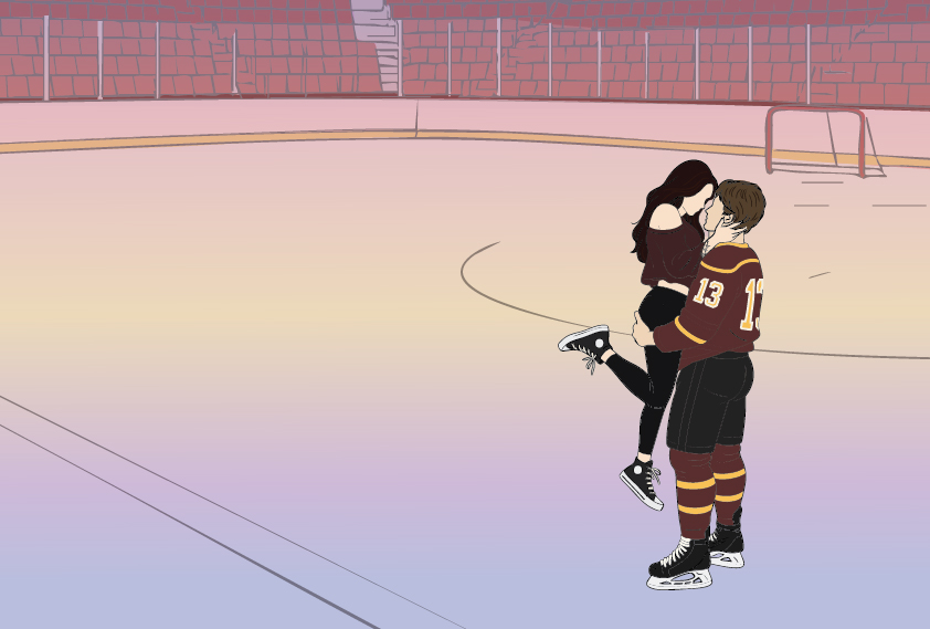
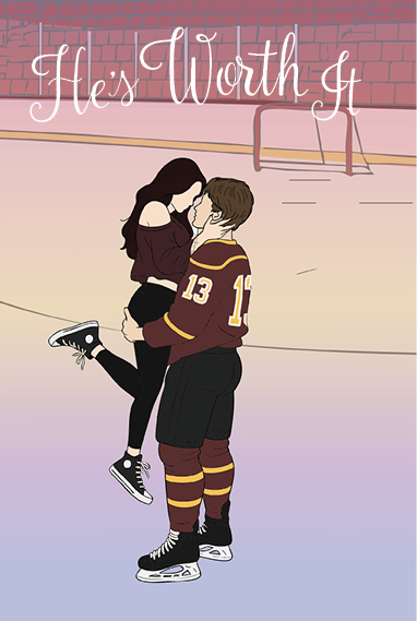
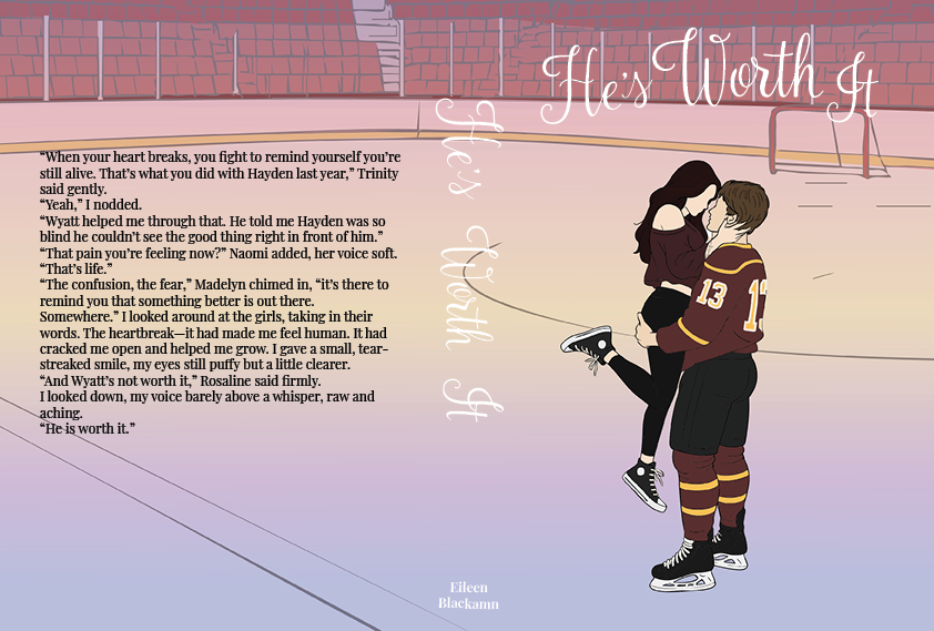
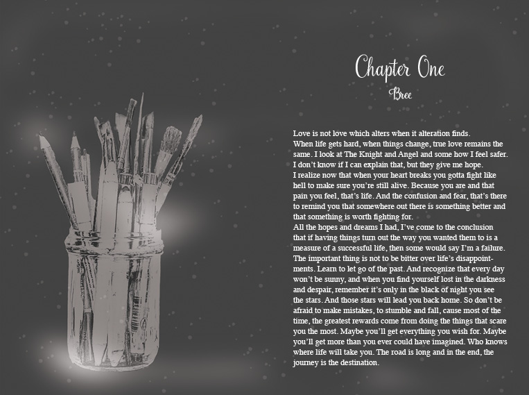
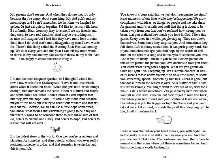
Chosen cover with design
The design process has been one of my favorite parts—choosing fonts, experimenting with layouts, and gathering inspiration from Pinterest and far too many trips to Indigo. I’d wander through the aisles studying book covers, imagining how they might influence my own. I chose this artwork for the cover because it comes from my favorite moment in the book—a scene where I feel my writing and my characters shine the most.
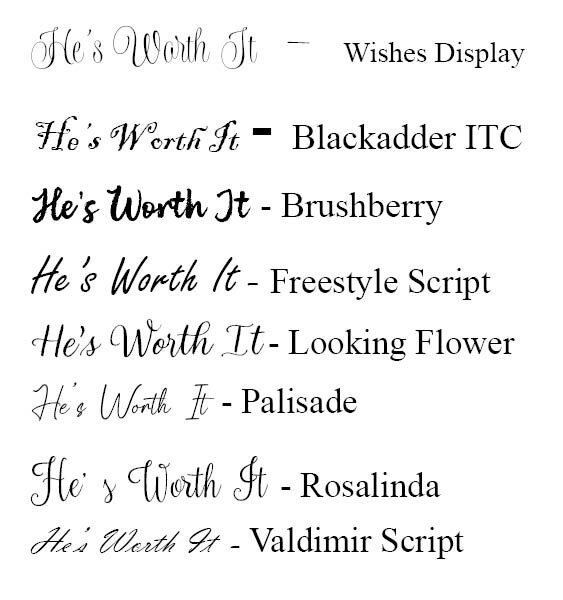
When searching for the perfect cover font, I narrowed down a long list to eight that fit the elegant, readable look I wanted. Rosalinda stood out instantly, its flowing strokes echo both skate marks and brush strokes, reflecting the characters’ love for hockey and art.
